 An official website of the United States government




This style guide provides examples of components and options for content editors when creating or editing pages on this site.
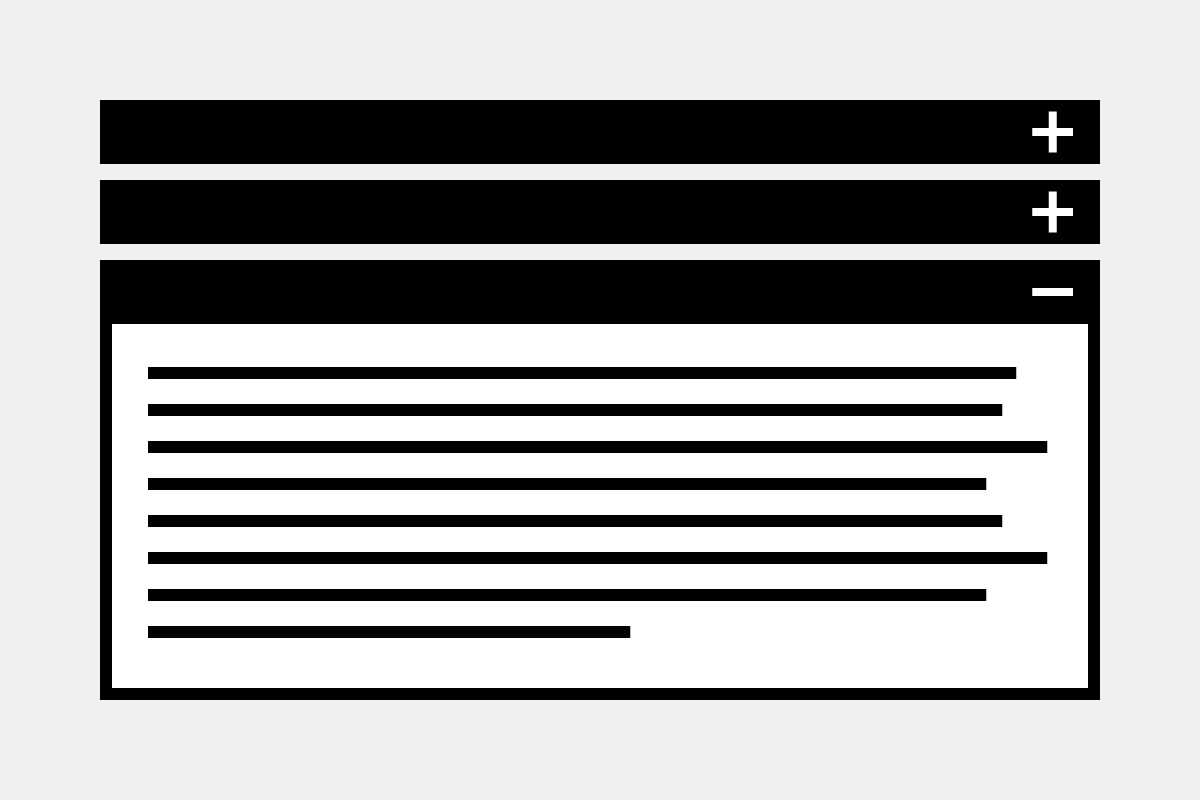
The accordion component is a list of headers that hide or reveal additional content when selected.
Accordion
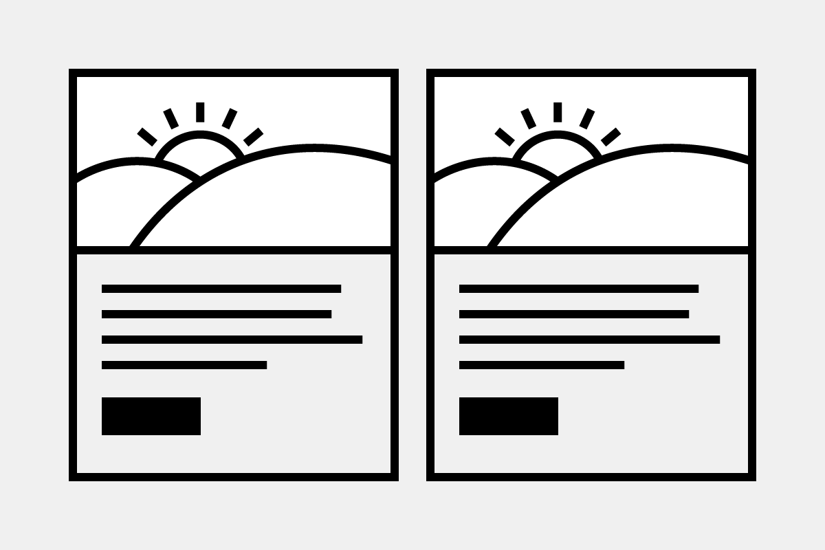
The card group component is a group of cards that contain content and actions about a single subject.
Card group
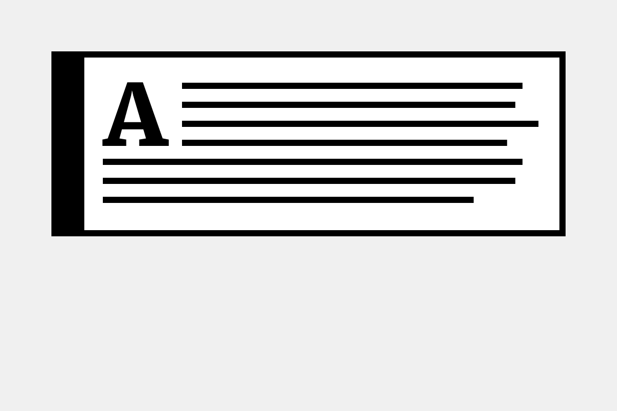
The callout component provides a box to highlight content.
Callout
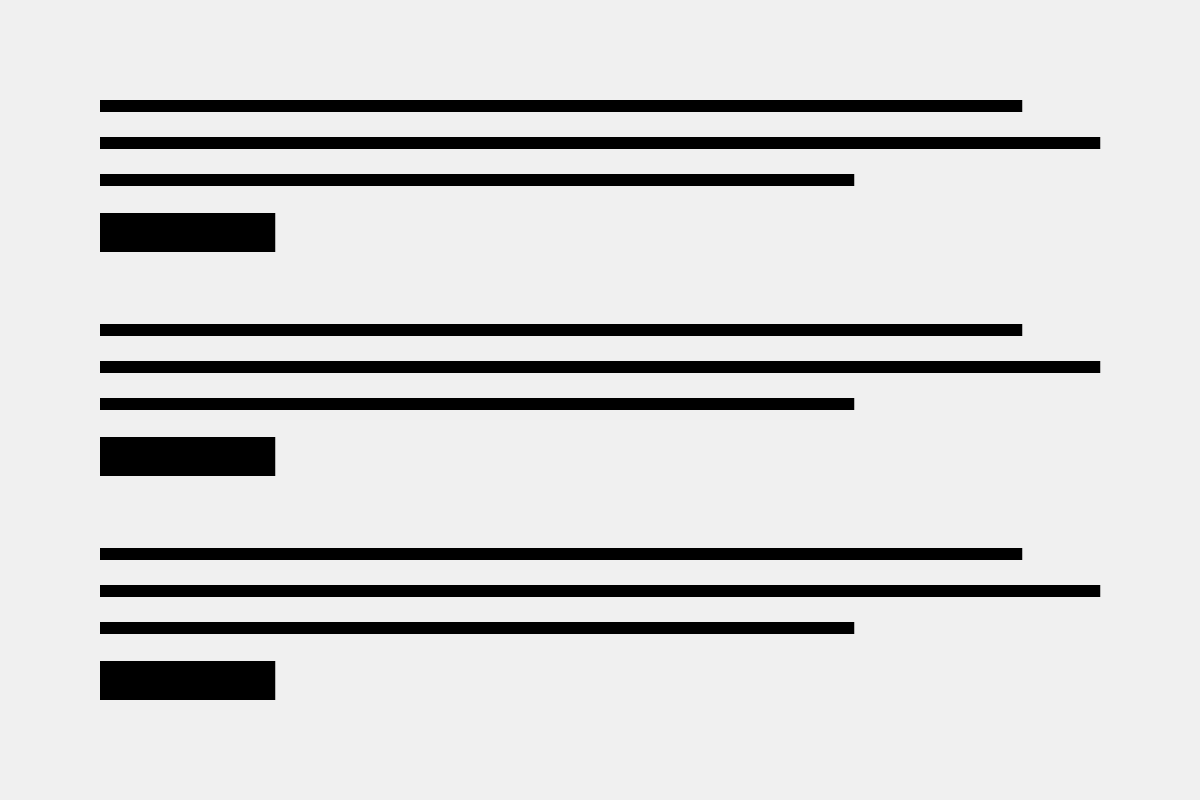
The collection component displays a compact list of multiple related items like articles or events.
Collection
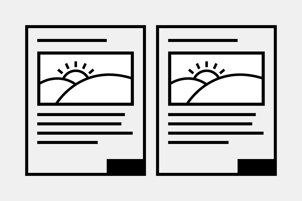
The flip card group component provides cards that can be flipped to a back side.
Flip card group
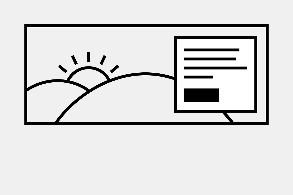
The hero component is a large banner, typically at the top of the page.
Hero
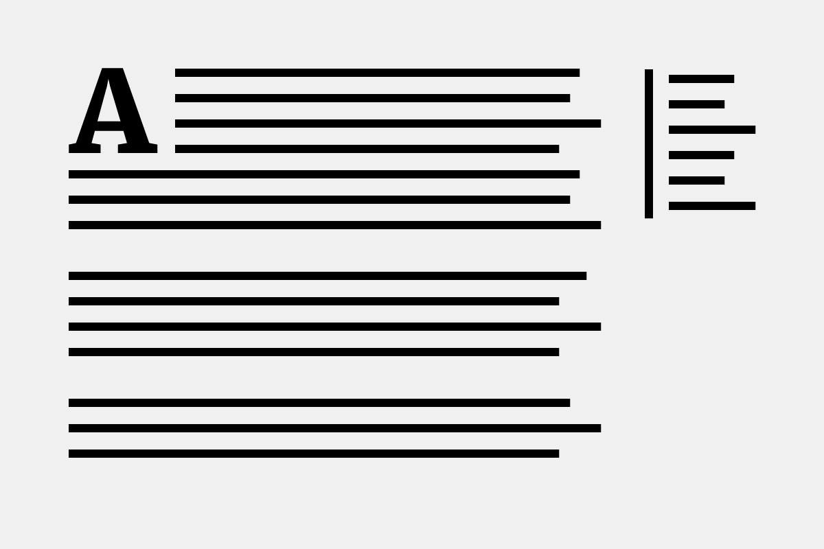
The in-page navigation allows navigation to specific sections on a lengthy content page.
In-page navigation
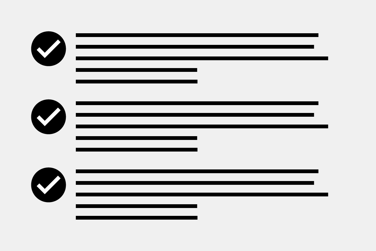
The icon list component provides a pre-defined list of icons to display alongside list items.
Icon list
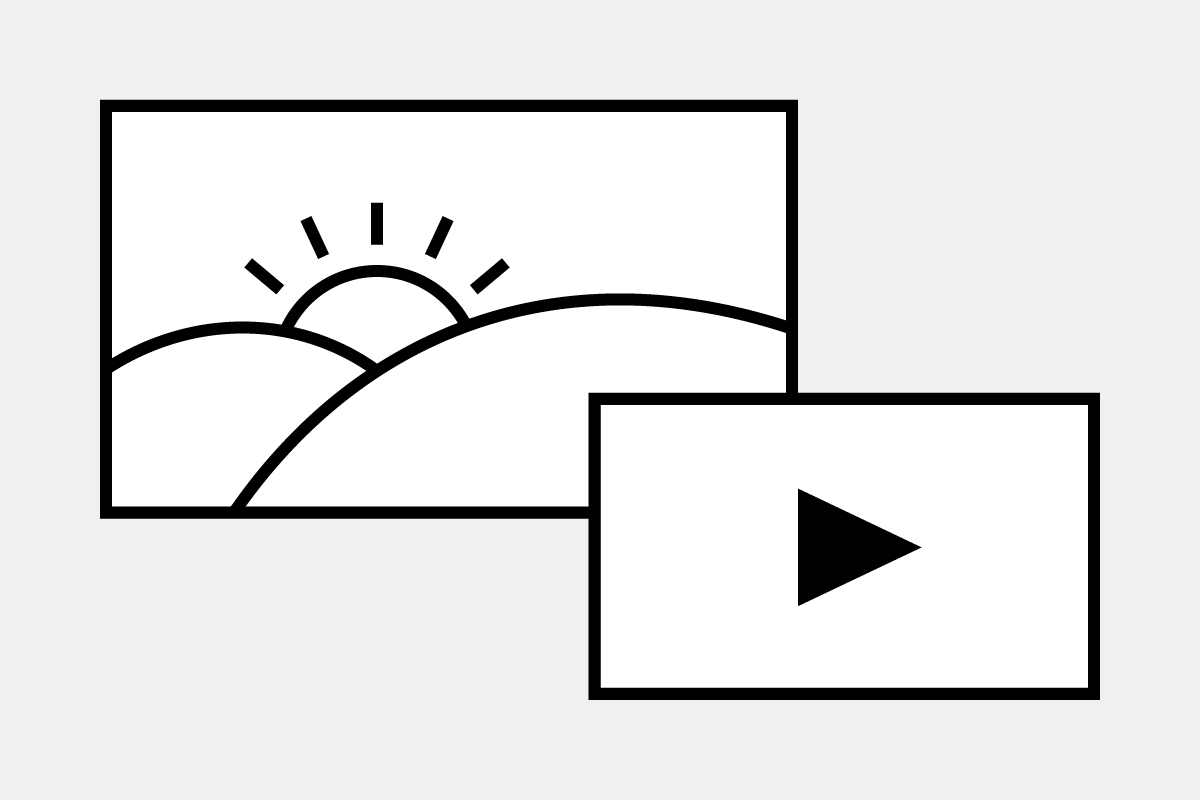
The media component provides the ability to add images or remote videos (from YouTube).
Media
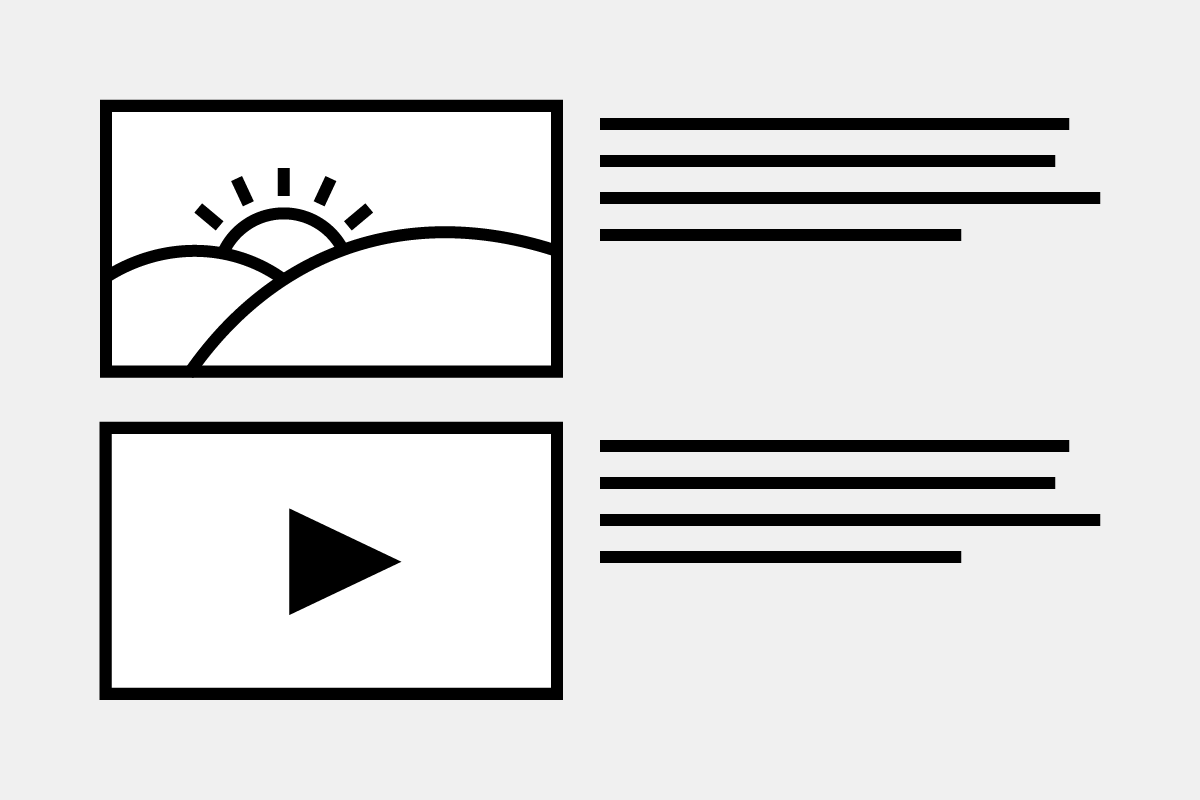
The media gallery component displays a thumbnail listing of images and remote videos (from YouTube).
Media gallery
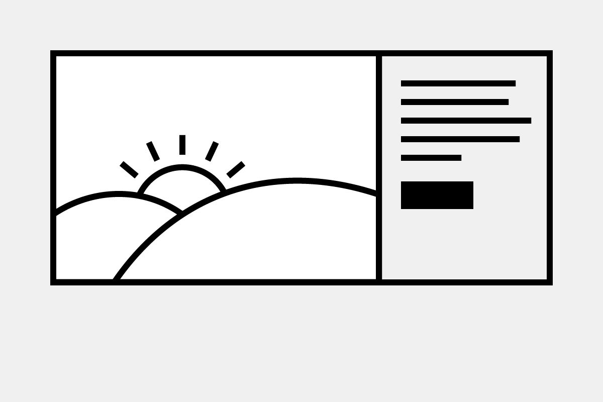
The promo block component provides a way to feature content.
Promo block
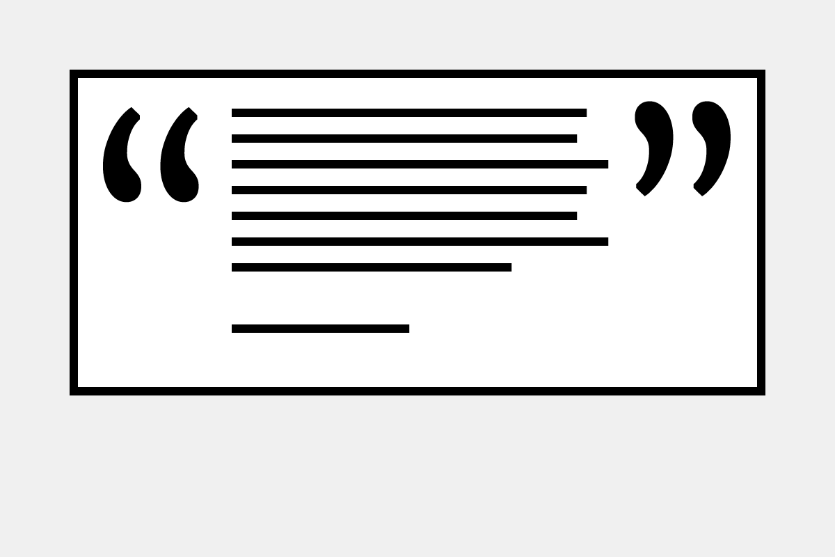
The quotation component provides a box to display a quote and its attribution.
Quotation
The row of columns component provides added flexibility when laying out components on a page.
Row of columns
The teaser list component is similar to a group of cards, but teasers don't have borders.
Teaser list
The text component provides a WYSIWYG editor for entering text.
Text
The thumbnail teaser list component displays a list of teasers with square thumbnail images.